Indoor Basketball Court Lacking Highlights? Refer to These Color-Matching Design Ideas
The interior design of a basketball court should not only meet functional requirements but also consider visual effects and atmosphere creation. Here are some recommended color-matching techniques and design approaches:
1. Combining Functionality and Atmosphere
Main Colors: Vibrant and Energetic
A basketball court should bring an energetic vibe to both players and spectators. Common main colors include bright red, orange, blue, and green, which can enhance vitality and foster a competitive atmosphere.
- Red: Symbolizes passion and strength, suitable for creating a high-energy environment.
- Blue: Represents calmness and stability, ideal for a rational and refreshing ambiance.
- Green: Associated with nature, offering a peaceful and comfortable feeling.
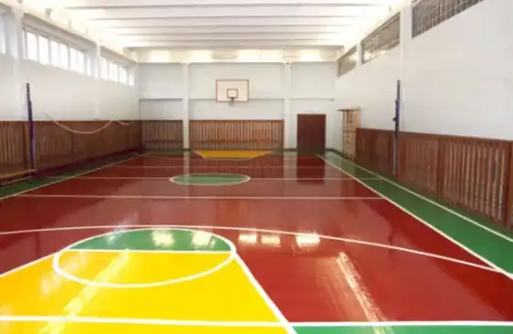
2. Distinguishing Court and Seating Areas
- Court: Eye-Catching and Prominent
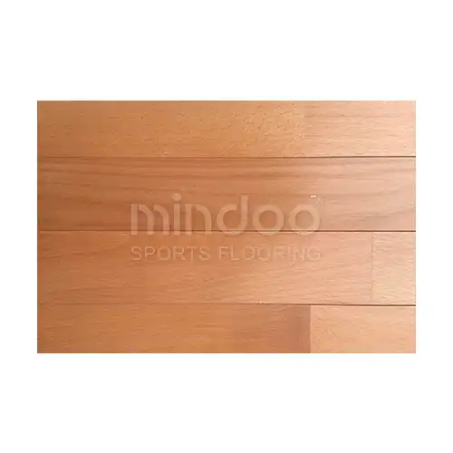
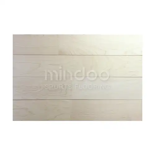
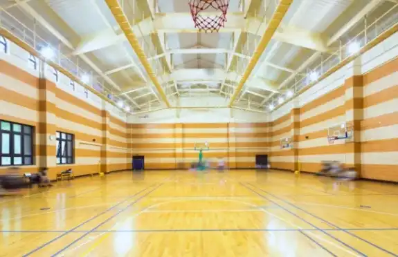
The flooring of the basketball court usually features vibrant tones like orange, blue, or dark wood textures, helping to clearly define the playing area visually.
- Wood Texture: Adds a natural and comfortable feel to the venue while enhancing professional aesthetics.
- Coatings: Opt for wear-resistant, low-reflection materials to minimize distractions and ensure player performance.
- Seating Areas: Neutral and Comfortable
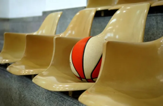
The seating areas should prioritize neutral tones like gray, deep blue, or black to keep the spectators’ focus on the game and avoid visual fatigue caused by overly bright colors.
3. Layering Colors and Detail Design
-Application of Brand Colors or Theme Colors
For basketball courts associated with specific clubs, schools, or leagues, the facility can incorporate brand colors to enhance identity and recognition.
- Decorative Details
Use detailed color matching on walls, flooring, ceilings, and lighting to elevate the overall design. For example, bright colors like orange or blue can be used for walls, while ceilings can feature soft white or light gray, enhancing the sense of spaciousness.
4. Enhancing Space and Lighting
- Ceiling Colors: Increasing Spatial Perception
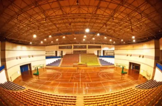
High-ceilinged basketball courts can use light tones like white or light gray to boost the sense of space and avoid feelings of restriction. Light colors also reflect light better, enhancing brightness.
-Lighting Design: Setting the Mood
Proper lighting is crucial for the overall atmosphere. Use soft white or natural light for better visual effects during games, avoiding light interference that might disrupt play.
5. Sustainability and Eco-Friendly Design
- Green Materials
Utilize eco-friendly materials like bamboo or reclaimed wood, which not only reflect sustainable values but also add unique textures and colors.
- Incorporation of Natural Elements
Consider integrating natural elements, like wall-mounted plants or natural materials, to enhance comfort and friendliness.
6. Dynamic and Energetic Designs
- Lines and Shapes: Emphasizing Movemen
Add flowing curves or dynamic linear designs on walls, flooring, or decorations to create a visually active environment.
- Use of Contrasting Colors
Bold color contrasts such as orange and blue, or red and green, can highlight different zones and add vitality.
7. ignage and Guidance System
-Signage Colors: Clarity and Readability
Signage within the basketball court should have highly visible color choices, often using contrasting colors (such as white, yellow, or black) to ensure clear direction, emergency exits, and other essential information.
Comprehensive Recommendations:
- Main Colors: Bright and energetic, such as blue, orange, or red.
- Zoning: Different areas should have distinct color schemes, such as courts, seating, ceilings, and walls.
- Details: Incorporating brand colors, signage colors, and natural elements for personalization and comfort.
- Lighting and Materials: Thoughtful combinations to improve spatial perception and comfort.
By implementing these design techniques, basketball courts can not only meet functional needs but also enhance visuals and the spectator experience.
